All Image 2.5 Prompts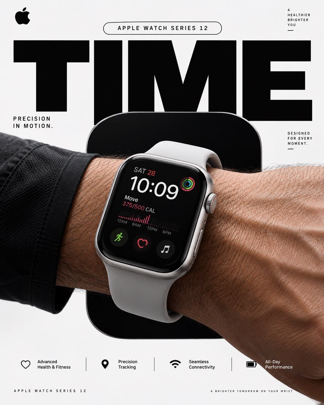
- Model
- GPT Image 2.5
- Category
- Products & Ads
Original Prompt
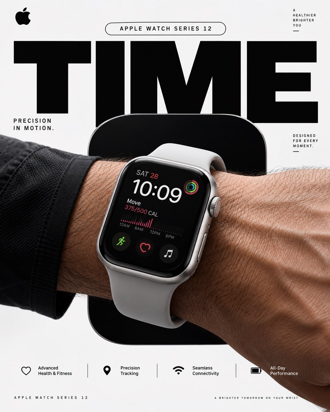
APPLE WATCH SERIES 12 — “TIME MOVES WITH YOU”

4:5 vertical premium poster, 8K, bold commercial layout × Swiss minimalism × photorealistic Apple product advertising

🧠 CORE IDEA:

“PRECISION, IN MOTION.”

🎬 LAYOUT:

BACKGROUND BLOCK:
Solid, uninterrupted Apple-inspired pure white / cool silver field with no environment, no scenery, no objects, no texture.
Ultra-clean studio backdrop with subtle tonal depth, controlled architectural shadows and precise geometric contrast.

GIANT TYPOGRAPHY:
“TIME” in bold oversized black typography, dramatically cropped behind the product.
Typography acts as a structural graphic element rather than decoration.

👤 SUBJECT:

Athletic human wrist and forearm entering dynamically from the edge of frame.
Apple Watch Series 12 worn naturally and realistically.

Watch positioned large in the foreground with the display clearly visible.

Realistic skin pores, fine arm hair, subtle veins, natural wrist anatomy, physically accurate proportions and believable contact between strap and skin.

⌚ PRODUCT + CONCEPTUAL TWIST:

Apple Watch Series 12 becomes the entire visual hero.

A single oversized rounded-rectangle cut-out sits directly behind the watch, precisely echoing the Apple Watch’s iconic case geometry.

Inside the rounded rectangle: deep graphite black.

The watch partially overlaps the shape, creating a strong graphic silhouette and layered depth while keeping the composition completely abstract and environment-free.

The rounded rectangle should feel like a giant architectural version of the watch itself.

✨ GRAPHIC ELEMENTS:

Oversized rounded-rectangle geometry
Giant cropped TIME typography
Thin precision measurement lines
Minimal technical annotation
Small Apple-style microtype
Controlled hard-edged shadow
Precise alignment grid
Generous negative space
Subtle silver/graphite accents
No decorative clutter

✍️ TEXT SYSTEM:

Top pill:
“Apple Watch Series 12”

Primary supporting line:
“Precision in Motion”

Small technical microtype:
“DESIGNED FOR EVERY MOMENT”

BOTTOM FEATURE STRIP:

Advanced Health & Fitness
Precision Tracking
Seamless Connectivity
All-Day Performance

🎨 COLOR SYSTEM:

Apple White × Graphite Black × Cool Silver

Extremely restrained palette.
High contrast.
No gradients that look artificial.
No excessive blue, neon, or colorful effects.

📸 PHOTOGRAPHY:

Premium global product advertising photography.
Large-format commercial camera aesthetic.
50mm–85mm lens, controlled perspective, extremely sharp product detail.
Soft directional key light + controlled studio fill + crisp contact shadows.
Physically accurate reflections on glass and metal.
Natural skin rendering.
High dynamic range.
True-to-life materials.

🧠 ANTI-SLOP DIRECTION:

No landscape, no architecture, no room, no desk, no clouds, no scenery, no floating objects, no holograms, no particles, no neon, no futuristic interface, no excessive reflections, no fake lens flare, no random props, no unnecessary environmental elements, no distorted wrist, no malformed fingers, no warped watch case, no incorrect strap geometry, no duplicated watch, no unrealistic screen perspective, no CGI appearance.

The final image must look like a real Apple global advertising campaign photographed in a controlled studio, combined with sophisticated Swiss graphic design.

Clean. Precise. Bold. Product-first. Zero visual clutter.
Read Full Prompt ↗
Source: @Diplomeme
More Products & Ads Examples
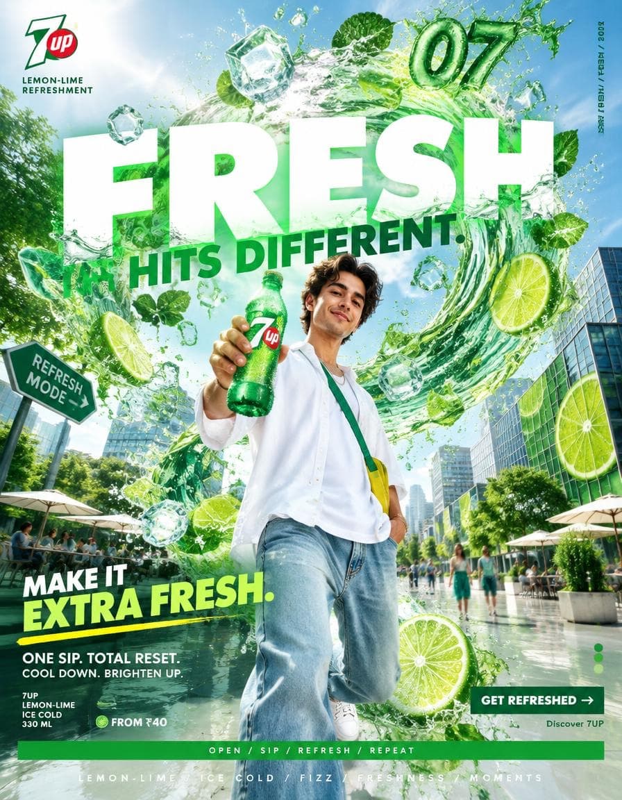
7UP — “MAKE IT EXTRA REFRESHING” ━━━━━━━━━━━━━━━━━━━━━━━━━━━━━━━━━━━━ PROMPT — 7UP “MAKE IT EXTRA REFRESHING” FORMAT Ultra-Premium 7UP SMM Promotional Poster Vertical 4:5 Instagram Hero Creative Global Soft Drink Campaign Contemporary Beverage Advertising Surrealist Commercial Photography × Freshness × Pop Design × Graphic Art Direction Agency-Level Art Direction Behance Front Page Quality 8K UHD Hyper-Realistic Surrealism × Product Photography × Contemporary Advertising High-Impact Visual Communication Zero AI Slop Zero Generic Beverage Advertising Zero Catalogue Aesthetic Zero Basic Soda Advertisement Zero Luxury-Copycat Aesthetic ━━━━━━━━━━━━━━━━━━━━━━━━━━━━━━━━━━━━ CORE STRATEGY This is not simply a 7UP product advertisement. This is 7UP turning refreshment into a physical force. The campaign should communicate: ONE SIP. TOTAL RESET. 7UP should feel: fresh + playful + optimistic + energetic + youthful + spontaneous + crisp + uncomplicated The visual language should combine: 7UP advertising × surrealist photography × contemporary pop design × premium beverage photography × summer culture × editorial graphic design The surrealism should be built around one simple idea: FRESHNESS CHANGES THE WORLD AROUND YOU. The world becomes brighter, lighter and more refreshing the instant 7UP enters the scene. No random fantasy. No excessive CGI. No psychedelic dream world. The impossible elements should feel tactile, refreshing and commercially believable. ━━━━━━━━━━━━━━━━━━━━━━━━━━━━━━━━━━━━ CAMPAIGN IDEA “MAKE IT EXTRA REFRESHING” Imagine an ordinary city afternoon. Hot pavement. Harsh sunlight. Busy streets. People looking exhausted. Then someone opens an ice-cold 7UP. Suddenly: the entire environment transforms into a giant refreshing wave. The pavement becomes sparkling translucent water. Buildings bend like sheets of fresh mint. Trees explode into oversized citrus leaves. Ice cubes float through the air. Lime slices become enormous graphic discs. A giant stream of sparkling 7UP travels through the city. The hero remains completely calm at the center. The message: WHEN LIFE GETS HEAVY, MAKE IT EXTRA REFRESHING. ━━━━━━━━━━━━━━━━━━━━━━━━━━━━━━━━━━━━ MASTER VISUAL Create a surreal contemporary city plaza during an intensely bright summer afternoon. The environment begins as a realistic hot urban setting. Concrete. Glass. Sunlight. Pedestrians. Cafés. Traffic. Then an enormous wave of crystal-clear sparkling 7UP cuts through the city. The wave bends around buildings. Passes underneath cars. Travels across walls. Splashes upward. Turns into translucent architectural structures. Inside the wave: ice cubes + lime slices + carbonation bubbles + mint leaves are suspended in mid-air. At the exact center stands the hero subject holding an ice-cold 7UP bottle. Everything around them has been transformed by freshness. The scene should feel like: a real commercial production that somehow captured a physical wave of refreshment. ━━━━━━━━━━━━━━━━━━━━━━━━━━━━━━━━━━━━ HERO PRODUCT Chilled 7UP bottle or can. Classic green packaging. Bright yellow-green citrus accents. Heavy realistic condensation. Individual water droplets. Visible carbonation. Clear fizzy beverage. Realistic transparent liquid. Authentic label treatment. Clean 7UP branding. No distorted logo. No melted typography. No impossible packaging. The product should look commercially manufactured and professionally photographed. Place the hero product prominently in the foreground. The bottle should be one of the sharpest elements in the composition. ━━━━━━━━━━━━━━━━━━━━━━━━━━━━━━━━━━━━ HERO SUBJECT Young adult. Contemporary global appearance. Natural skin texture. Realistic anatomy. Fresh, energetic expression. Relaxed confidence. Subtle smile. No exaggerated influencer expression. No beauty-commercial posing. The person should feel like they were genuinely caught enjoying an unexpectedly refreshing moment. One hand holds the 7UP. The other hand relaxed naturally. Body slightly turned toward camera. ━━━━━━━━━━━━━━━━━━━━━━━━━━━━━━━━━━━━ WARDROBE Contemporary summer streetwear. Oversized white shirt. Loose light denim trousers. Clean white sneakers. Small green accessory. Subtle citrus-yellow detail. Minimal jewelry. Natural styling. No excessive logos. No luxury fashion. No futuristic clothing. The wardrobe should feel: fresh + youthful + effortless + wearable. ━━━━━━━━━━━━━━━━━━━━━━━━━━━━━━━━━━━━ SURREALISM SYSTEM The surrealism follows one central rule: REFRESHMENT FLOWS THROUGH EVERYTHING. The 7UP wave should transform: * pavement into sparkling water * concrete walls into translucent citrus surfaces * street signs into lime-shaped forms * architecture into flowing curves * sunlight into sparkling particles * fountains into giant carbonation streams * trees into oversized mint-and-lime structures * shadows into liquid reflections Add: * floating ice * lime slices * carbonation bubbles * condensation droplets * crystal-clear splashes * translucent green surfaces Every surreal element must reinforce: freshness + citrus + fizz + cooling relief. ━━━━━━━━━━━━━━━━━━━━━━━━━━━━━━━━━━━━ SIGNATURE SURREAL DEVICE Create one enormous 7UP FRESHNESS WAVE. The wave emerges from behind the hero bottle. It begins as a small sparkling splash. Then grows into a monumental transparent green-tinted wave. It curves upward behind the subject. It passes between buildings. It forms a giant circular arc around the composition. Within the wave: ice cubes + lime slices + bubbles are suspended with realistic fluid physics. At the top of the wave: 07 At the bottom: FRESHNESS / UNLIMITED This becomes the campaign’s visual signature. ━━━━━━━━━━━━━━━━━━━━━━━━━━━━━━━━━━━━ COMPOSITION VISUAL HIERARCHY 7UP BRAND ↓ HERO PRODUCT ↓ FRESHNESS WAVE ↓ HERO SUBJECT ↓ CITRUS ENVIRONMENT ↓ CAMPAIGN MESSAGE ↓ CTA Product: 15–20% Hero subject: 15–20% Surreal environment: 55–60% Typography / promotional information: 10–15% The composition should feel energetic without becoming visually chaotic. ━━━━━━━━━━━━━━━━━━━━━━━━━━━━━━━━━━━━ 7UP COLOR SYSTEM 7UP GREEN Primary campaign color. Use saturated fresh green across: Product packaging Graphic blocks Liquid wave Environmental accents CITRUS LIME Bright yellow-green. Use for: Lime slices Highlights Small graphic elements Freshness particles WHITE Used for: Typography Negative space Foam Highlights DARK GREEN Used for: Shadows Typography Supporting graphic elements The palette should feel cold, crisp and refreshing. ━━━━━━━━━━━━━━━━━━━━━━━━━━━━━━━━━━━━ COLOR RATIO 40% white / bright architectural neutrals 30% fresh green 15% lime-yellow 10% deep green 5% natural skin / environmental tones The green should immediately trigger the idea of freshness without turning the entire image into a flat green advertisement. ━━━━━━━━━━━━━━━━━━━━━━━━━━━━━━━━━━━━ BACKGROUND Create a contemporary urban summer plaza. White concrete architecture. Glass façades. Outdoor café seating. Open pedestrian space. Modern geometric buildings. Small trees. Bright sunlight. No recognizable city. No famous landmarks. No nightclub. No beach resort. No generic tropical island. No cyberpunk environment. The location should feel like a global modern city experiencing an impossible freshness event. ━━━━━━━━━━━━━━━━━━━━━━━━━━━━━━━━━━━━ CITRUS WORLD Introduce large but carefully controlled citrus details. One oversized lime slice partially embedded into a concrete wall. Small lime slices suspended inside the freshness wave. Mint leaves travelling through the liquid. Tiny bubbles catching sunlight. Ice cubes refracting the environment. A subtle citrus mist surrounding the hero. Everything should remain photorealistic. Do not turn the image into a fruit collage. ━━━━━━━━━━━━━━━━━━━━━━━━━━━━━━━━━━━━ GRAPHIC DESIGN SYSTEM Create a bold contemporary 7UP editorial grid. Use: oversized typography green graphic blocks lime-yellow accents thin rules circular citrus graphics large numerals micro typography directional arrows temperature indicators refreshment codes cropped typography vertical labels Subtle campaign information: 07 / FRESH ICE COLD CITRUS / FIZZ / RESET REFRESH MODE The graphic system should feel like a premium global beverage campaign, not an infographic. ━━━━━━━━━━━━━━━━━━━━━━━━━━━━━━━━━━━━ TYPOGRAPHY SYSTEM PRIMARY HEADLINE Large bold contemporary sans-serif. Rounded but confident. Heavy weight. Clean geometry. High readability. Use slightly oversized typography with playful cropping. The typography should feel: fresh + energetic + contemporary. Avoid: luxury serif typography. traditional soda typography. generic sports fonts. overly futuristic type. ━━━━━━━━━━━━━━━━━━━━━━━━━━━━━━━━━━━━ TOP LEFT 7UP logo. Small. Clean. Official-style treatment. Generous clear space. Underneath: LEMON-LIME REFRESHMENT Small uppercase typography. No logo distortion. ━━━━━━━━━━━━━━━━━━━━━━━━━━━━━━━━━━━━ GIANT CENTER TYPOGRAPHY Massive: FRESH Then: HITS DIFFERENT. The word FRESH should occupy a major portion of the composition. Allow the freshness wave to pass behind and through the typography. Some letters should appear partially submerged inside the transparent liquid. Typography remains crisp and readable. ━━━━━━━━━━━━━━━━━━━━━━━━━━━━━━━━━━━━ CAMPAIGN TITLE Lower-left: MAKE IT Then substantially larger: EXTRA FRESH. Add a lime-yellow underline. ━━━━━━━━━━━━━━━━━━━━━━━━━━━━━━━━━━━━ SUPPORTING COPY ONE SIP. TOTAL RESET. Secondary: COOL DOWN. BRIGHTEN UP. Short. Playful. No unnecessary marketing paragraph. ━━━━━━━━━━━━━━━━━━━━━━━━━━━━━━━━━━━━ PRODUCT INFORMATION Small structured block: 7UP LEMON-LIME ICE COLD 330 ML Use precise micro typography. ━━━━━━━━━━━━━━━━━━━━━━━━━━━━━━━━━━━━ PROMOTIONAL STRIP Create a thin bright-green horizontal block. Inside: OPEN / SIP / REFRESH / REPEAT White uppercase typography. Integrated into the overall grid. Not a discount banner. ━━━━━━━━━━━━━━━━━━━━━━━━━━━━━━━━━━━━ CTA Bottom-right: GET REFRESHED → Dark-green rectangular button. White typography. Underneath: Discover 7UP Compact. ━━━━━━━━━━━━━━━━━━━━━━━━━━━━━━━━━━━━ PRICE Optional India-market version: FROM ₹40 Small. Secondary. Do not make the poster feel retail-focused. ━━━━━━━━━━━━━━━━━━━━━━━━━━━━━━━━━━━━ BOTTOM FEATURE STRIP Thin dark-green rule. Then: LEMON-LIME / ICE COLD / FIZZ / FRESHNESS / MOMENTS Centered beneath. ━━━━━━━━━━━━━━━━━━━━━━━━━━━━━━━━━━━━ VERTICAL EDGE TEXT Right edge: 7UP / FRESH / CITRUS / 2026 Rotated vertically. Small. Precise. ━━━━━━━━━━━━━━━━━━━━━━━━━━━━━━━━━━━━ PHOTOGRAPHIC STYLE Premium global beverage campaign photography. Hyper-realistic. Bright. Crisp. Refreshing. Real human skin. Real fabric. Real glass. Real liquid. Real ice. Real lime texture. Real carbonation. The image should feel like an extremely expensive commercial production photographed at the exact moment a surreal freshness wave hits the city. No illustration. No cartoon. No obvious CGI. ━━━━━━━━━━━━━━━━━━━━━━━━━━━━━━━━━━━━ LIQUID / ICE PHYSICS The 7UP liquid must behave realistically. Transparent carbonated beverage. Tiny bubbles. Natural splash arcs. Realistic surface tension. Individual droplets. Clear ice. Natural refraction. Condensation beads. Correct glass reflections. The giant wave may be surreal in scale, but its fluid physics must remain believable. ━━━━━━━━━━━━━━━━━━━━━━━━━━━━━━━━━━━━ LIGHTING Bright summer sunlight. Large directional source from upper-left. Strong crisp shadows. High-key environment. Bright reflections on glass. Green liquid catching sunlight. Lime slices glowing naturally through backlight. Ice producing realistic caustic reflections. Natural skin exposure. No neon. No colored fog. No excessive bloom. No dreamy luxury haze. The image should feel cold despite being photographed under hot sunlight. ━━━━━━━━━━━━━━━━━━━━━━━━━━━━━━━━━━━━ CAMERA ARRI Alexa Mini LF 35mm premium commercial lens Slightly low camera position. Hero product foreground. Subject centered. Large environmental perspective. Moderate depth of field. High dynamic range. Extremely detailed product. Natural optical characteristics. Premium global beverage advertising photography. ━━━━━━━━━━━━━━━━━━━━━━━━━━━━━━━━━━━━ POST-PRODUCTION Contemporary global 7UP campaign grading. Clean whites. Fresh saturated green. Controlled citrus yellow. Deep green shadows. Natural skin. High micro-contrast. Crystal-clear liquid. Detailed ice. Sharp condensation. Crisp graphic edges. Subtle film grain. Controlled highlights. No plastic skin. No artificial HDR. No teal-orange grade. No excessive saturation. No fake CGI glow. No excessive grain. ━━━━━━━━━━━━━━━━━━━━━━━━━━━━━━━━━━━━ BRAND SAFETY / CONSISTENCY The final visual must immediately communicate 7UP without relying solely on the logo. Brand recognition should come from: fresh green lemon-lime identity crisp carbonation refreshment playfulness optimism summer energy clean visual language bold graphic design ice-cold product photography Do not make it resemble: Sprite’s green citrus advertising. Mountain Dew’s extreme-sports aesthetic. Coca-Cola’s red emotional storytelling. Pepsi’s electric-blue cultural energy. Fanta’s colorful playful world. Generic lemon-lime soda advertising. Generic summer beverage advertising. Random AI surrealism. The visual identity must remain unmistakably 7UP. ━━━━━━━━━━━━━━━━━━━━━━━━━━━━━━━━━━━━ FINAL FEEL If: 7UP × a surrealist artist × a world-class beverage photographer × a contemporary graphic design studio × a global advertising agency created one campaign together— the result should feel like: MAKE IT EXTRA FRESH. Not a bottle floating in a green background. Not a generic summer advertisement. Not a fruit collage. Not a basic soda poster. Not random surrealism. Not an AI fantasy image. A high-impact 7UP campaign where one sip sends an impossible wave of freshness through an overheated world. Vertical 4:5 — 8K UHD — hyper-realistic — surreal urban summer environment — giant transparent freshness wave — lemon-lime visual language — fresh green/lime/white palette — hero chilled 7UP product — realistic condensation — carbonation and liquid physics — oversized contemporary typography — precise editorial grid — natural human anatomy — authentic summer styling — detailed glass and ice — physically believable surrealism — accurate 7UP branding treatment — crisp readable typography — premium commercial photography — agency-level art direction — Instagram hero creative — Behance front-page quality — print-ready.
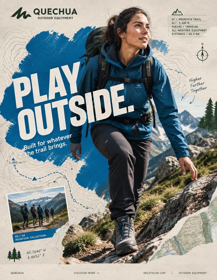
QUECHUA — “PLAY OUTSIDE.” BEHANCE-LEVEL DIGITAL COLLAGE CAMPAIGN FORMAT Ultra-Premium QUECHUA Outdoor Campaign Key Visual Vertical 4:5 Instagram Hero Creative Behance Front Page Quality Global Outdoor & Hiking Campaign Senior Social Media Art Direction Contemporary Outdoor Photography × Handcrafted Digital Collage × Editorial Graphic Design 8K UHD Hyper-Realistic Outdoor Photography High-End Editorial Art Direction Print-Quality Graphic Execution Premium Commercial Adventure Campaign Strong Visual Storytelling Tactile Mixed-Media Aesthetic Zero AI Slop Zero Generic Hiking Advertisement Zero Stock-Photo Feeling Zero Influencer Travel Aesthetic Zero Corporate Catalogue Layout Zero Luxury-Adventure Copycat Zero Random Graphic Decoration The final artwork must feel deliberately designed by a senior art director and assembled by a professional digital collage artist — not generated as a collection of unrelated elements. CREATIVE CONCEPT CAMPAIGN: “PLAY OUTSIDE.” CORE MESSAGE: THE OUTDOORS BELONGS TO EVERYONE. The campaign celebrates the instinct to leave the ordinary behind. A trail after work. A mountain on the weekend. A cold morning hike. A sudden change in weather. A long walk with friends. A place you have never explored before. Quechua becomes the equipment that makes everyday exploration possible. The visual should communicate: EXPLORATION FREEDOM DISCOVERY ADVENTURE MOVEMENT RESILIENCE COMMUNITY OUTDOOR LIFE The campaign should feel: AUTHENTIC ADVENTUROUS YOUTHFUL RAW OPTIMISTIC HUMAN ENERGETIC ACCESSIBLE ART DIRECTION Think: QUECHUA × OUTDOOR EDITORIAL × MOUNTAIN JOURNAL × HANDCRAFTED POSTER × TOPOGRAPHIC MAP × CONTEMPORARY DIGITAL COLLAGE The artwork should combine highly realistic outdoor photography with visibly handmade graphic interventions. The contrast is essential: REAL HUMAN + REAL OUTDOOR ENVIRONMENT + REAL QUECHUA PRODUCT + HANDMADE GRAPHICS + TOPOGRAPHIC INFORMATION + EDITORIAL TYPOGRAPHY Do not make the environment look like an artificial fantasy landscape. The mountain must feel physically real. The weather must feel real. The clothing must look genuinely functional. The person must look like someone who actually hikes. Introduce controlled imperfections: rough paper edges hand-painted marks topographic contour lines slightly misregistered ink screen-print texture cut-paper shapes field-note markings visible paper fibers analog grain subtle photocopy texture These imperfections should feel intentionally art-directed. Never messy. Never amateur. PHASE 1 — HERO PHOTOGRAPHY SUBJECT: One energetic everyday outdoor explorer. Age: 20–30. Gender: Auto select based on strongest visual composition. Casting: Contemporary global and diverse. The person must look like a genuine Quechua customer rather than a fashion model. Natural facial structure. Natural skin texture. Realistic body proportions. Practical outdoor appearance. No influencer aesthetic. No luxury travel aesthetic. No expedition-superhero styling. EXPRESSION: Focused. Curious. Confident. Natural. A subtle authentic smile or concentrated expression. The emotion should communicate: “I WANT TO SEE WHAT IS AROUND THE NEXT CORNER.” ACTION Capture the subject at the absolute peak of outdoor movement. Preferred actions: HIKING UPHILL TRAIL RUNNING CROSSING A ROCKY RIDGE CLIMBING A STEEP TRAIL WALKING THROUGH A FOREST JUMPING ACROSS A SMALL STREAM DESCENDING A MOUNTAIN PATH TREKKING THROUGH LIGHT RAIN Choose ONE action with the strongest silhouette. The action must create a powerful diagonal. The body should naturally travel from: TOP LEFT toward BOTTOM RIGHT. The terrain should reinforce the movement direction. Capture authentic physical effort. Boots should interact naturally with rocks, soil or trail surface. Clothing should react naturally to wind and movement. No impossible body positioning. No floating feet. No fantasy climbing. HERO PRODUCT ONE CLEARLY VISIBLE QUECHUA PRODUCT ONLY. Choose the product that best supports the selected adventure. Examples: QUECHUA HIKING JACKET QUECHUA BACKPACK QUECHUA HIKING BOOTS QUECHUA FLEECE QUECHUA RAIN JACKET QUECHUA TREKKING TROUSERS QUECHUA TENT The product must be unmistakably visible. Product placement should feel naturally integrated into the adventure. No floating product. No duplicate product. No product lineup. The hero product receives secondary visual emphasis after the explorer. Preserve accurate product construction: fabric stitching zippers buckles straps pockets waterproof details sole construction technical materials brand markings PHOTOGRAPHIC STYLE Premium editorial outdoor campaign photography. Authentic natural lighting. Documentary adventure energy. Real mountain atmosphere. Natural skin. High-resolution textile detail. Realistic terrain. Camera: SONY A1 II Lens: 85mm Aperture: f/2.8 Camera position: Slight low-angle hero perspective. Crop: 3/4 body or full body depending on action. The explorer must be isolated with an exceptionally clean professional cutout when required for the collage. Preserve: hair detail fabric edges hands boots backpack straps equipment natural movement No artificial cutout halo. No white outline. No excessive sharpening. PHASE 2 — COLOR FOUNDATION PRIMARY QUECHUA OUTDOOR BLUE Use a strong outdoor-inspired Quechua blue as the principal graphic accent. SUPPORTING COLORS: Off-white Warm stone grey Deep forest green The palette should feel connected to: mountain sky rock forest trail technical outdoor equipment Keep the graphic system controlled. Avoid excessive colors. PRIMARY PAINT FORM Create ONE enormous irregular outdoor-blue paint form. Occupy approximately: 45–55% of the composition. The shape should function as the visual foundation of the collage. Appearance: hand-painted thick brush texture organic edges dry-brush imperfections visible bristle marks slight transparency variations screen-print character paper interaction The paint should feel physically applied to recycled expedition paper. Not a smooth digital blob. Not a generic vector shape. The explorer should overlap the paint form. The product must remain completely visible. PHASE 3 — COLLAGE SYSTEM Introduce exactly five major handcrafted graphic elements. Select from: TOPOGRAPHIC CONTOUR LINES TRAIL ROUTE LINES HAND-DRAWN CIRCLES COMPASS SYMBOLS ALTITUDE MARKERS MOUNTAIN SILHOUETTES GPS COORDINATE MARKINGS ELEVATION GRAPHICS HAND-DRAWN ARROWS WEATHER SYMBOLS TERRAIN MAP FRAGMENTS HALFTONE DOTS FIELD-NOTE MARKINGS Each element must have a visual purpose. Do not scatter graphics randomly. Graphics should reinforce: direction altitude location distance terrain exploration Use asymmetric placement. Create a strong diagonal rhythm. Some elements may pass behind the explorer. Some may partially disappear beneath typography. One or two graphic elements may overlap the subject subtly to create physical depth. MATERIAL LANGUAGE Build the collage as though physically assembled from an explorer’s field notebook. Include subtle: torn-paper edges folded map fragments screen-print texture photocopy artifacts ink bleed dry-brush marks recycled paper fibers topographic printing handwritten route markings subtle registration offsets analog grain The artwork should feel tactile. It should resemble: A MOUNTAIN MAP AN OUTDOOR MAGAZINE A HANDMADE ADVENTURE POSTER. Do not overdo the texture. PHASE 4 — TYPOGRAPHY PRIMARY HEADLINE: PLAY OUTSIDE. Make this the second-largest visual element after the explorer. Large bold uppercase geometric sans-serif. Extremely strong weight. Tight leading. Compact composition. Minimal tracking. Allow a slight 2–4° rotation. The typography should feel physically printed onto the artwork. Not floating. Not glossy. Not 3D. Not futuristic. Typography should interact with the collage. Allow: partial cropping layer overlap masking paint interruption map-line interruption edge cropping PRIMARY COPY: PLAY OUTSIDE. SUPPORTING COPY: Built for whatever the trail brings. Keep supporting copy small and highly readable. TYPOGRAPHIC HIERARCHY 01 QUECHUA BRANDING 02 PLAY OUTSIDE. 03 Built for whatever the trail brings. 04 TRAIL / ALTITUDE / ADVENTURE INFORMATION 05 DISCOVER MORE The headline must remain instantly readable even at Instagram thumbnail size. PHASE 5 — QUECHUA BRANDING Place the official QUECHUA branding in the upper-left. Preserve: correct proportions clear space accurate wordmark brand integrity Do not distort. Do not stretch. Do not place the logo inside unnecessary effects. Small supporting line: OUTDOOR EQUIPMENT The branding should remain visible but should not compete with: PLAY OUTSIDE. PHASE 6 — BACKGROUND BACKGROUND COLOR: Warm Light Stone Grey The background should resemble premium recycled expedition paper. Add extremely subtle: paper grain recycled fiber analogue noise soft printing imperfections faint topographic texture Texture opacity: Below 15%. The background must remain visually quiet. The energy comes from: THE EXPLORER THE TERRAIN THE PAINT FORM THE TOPOGRAPHIC GRAPHICS. PHASE 7 — COMPOSITION MODEL POSITION: Off-center. Never dead center. Place the explorer slightly toward the visual intersection of the composition. NEGATIVE SPACE: Approximately 18%. Allow breathing room around the major elements. LAYER ORDER: 01 BACKGROUND 02 PAPER TEXTURE 03 TOPOGRAPHIC MAP FRAGMENTS 04 PAINT FORM 05 HANDMADE GRAPHIC ELEMENTS 06 EXPLORER PHOTOGRAPH 07 PRODUCT 08 TYPOGRAPHY 09 MICRO INFORMATION 10 BRANDING 11 FOOTER The explorer should appear to physically exist inside the collage. MOVEMENT DIRECTION TOP LEFT ↓ MOUNTAIN RIDGE ↓ EXPLORER ↓ BOTTOM RIGHT The entire composition should feel as if it is moving toward an unseen destination. The eye should travel naturally: BRANDING ↓ HEADLINE ↓ FACE ↓ PRODUCT ↓ TRAIL ↓ CTA PHASE 8 — VISUAL DEPTH Create three distinct depth planes. BACKGROUND: Recycled paper, faint mountain forms and subtle map texture. MIDGROUND: Paint forms, contour lines, trail maps, compass graphics and altitude information. FOREGROUND: Explorer, product and typography. Some contour lines should disappear behind the explorer. Some typography should overlap the paint. One small map element should overlap the subject subtly. This creates the feeling of a physically assembled outdoor editorial collage rather than a flat AI composition. PHASE 9 — BRAND DNA The artwork must communicate Quechua’s core outdoor identity: ACCESSIBLE ADVENTURE EVERYDAY EXPLORATION HIKING OUTDOOR DISCOVERY PRACTICAL INNOVATION WEATHER READINESS COMFORT COMMUNITY NATURE MOVEMENT The explorer should never look like an untouchable professional expedition athlete. The campaign should make the viewer think: “I could go there.” That feeling is more important than displaying extreme athletic performance. PHASE 10 — INFORMATION DESIGN Introduce a small editorial information block. Example: 01 / MOUNTAIN TRAIL ALT. 2,480 M HIKING / TREKKING ALL-WEATHER EQUIPMENT DISTANCE / 08.4 KM Use tiny but perfectly legible typography. Create visual hierarchy through: scale weight spacing alignment Not through excessive colors. PHASE 11 — SECONDARY COLLAGE FRAME Introduce ONE small secondary photographic frame. Place it asymmetrically. Inside: A secondary outdoor adventure moment. For example: a small group of hikers crossing a mountain trail. Frame it with a thin outdoor-blue border. Add: 02 / 04 MOUNTAIN COLLECTION The secondary image must feel like part of a printed outdoor field journal. It should support the campaign narrative without competing with the hero explorer. PHASE 12 — FOOTER Create a minimal bottom strip. Include: QUECHUA DISCOVER MORE → http:// DECATHLON.COM OUTDOOR EQUIPMENT Use very small clean typography. Keep the footer extremely restrained. No sale banner. No clutter. PHASE 13 — GRAPHIC IMPERFECTION Introduce controlled imperfections characteristic of high-end physical outdoor collage: slightly uneven paint edges tiny ink inconsistencies subtle map displacement minor registration shift hand-drawn contour variation faint photocopy noise slight paper edge wear These details should make the artwork feel human-made. The composition must still feel extremely polished. Think: ART-DIRECTED IMPERFECTION. Not RANDOM IMPERFECTION. PHASE 14 — LIGHTING & IMAGE QUALITY The original outdoor photograph must retain premium commercial photography quality. Natural mountain sunlight. Strong directional light. Realistic atmospheric depth. Crisp highlights. Controlled shadows. Natural skin exposure. Detailed technical fabric. Realistic rock and vegetation texture. Sharp hero product. Natural environmental reflections. No artificial HDR. No plastic skin. No beauty retouching. No excessive clarity. No fake cinematic glow. No neon. No fantasy lighting. over-saturated landscape. PHASE 15 — FINAL ART DIRECTION The final visual should look like a real campaign artwork created by: A SENIOR SOCIAL MEDIA ART DIRECTOR A PROFESSIONAL OUTDOOR PHOTOGRAPHER A DIGITAL COLLAGE ARTIST A TYPOGRAPHER A MAP / EDITORIAL DESIGNER Every element should appear intentional. Every layer should have a purpose. The explorer should provide realism. The Quechua product should provide commercial relevance. The typography should provide communication. The mountain environment should provide emotion. The map graphics should provide exploration. The paint form should provide brand energy. The paper texture should provide physicality. The composition should provide movement. FINAL FEEL If: QUECHUA × A CONTEMPORARY OUTDOOR MAGAZINE × A HAND-PAINTED MOUNTAIN POSTER × A TOPOGRAPHIC FIELD JOURNAL × A MODERN GRAPHIC DESIGN STUDIO created one campaign together. The final result should feel: RAW. HUMAN. OUTDOOR. TACTILE. ADVENTUROUS. ACCESSIBLE. YOUTHFUL. EXPLORATIVE. REAL. Not a catalogue. Not a generic hiking advertisement. Not a luxury outdoor campaign. Not a travel-influencer post. Not a corporate retail graphic. Not an AI-generated mountain collage. A genuine Quechua campaign where: PHOTOGRAPHY + TERRAIN + PRODUCT + TYPOGRAPHY + TOPOGRAPHIC GRAPHICS + HANDCRAFTED COLLAGE become one visual system. FINAL GENERATION SPECIFICATION Vertical 4:5 8K UHD Hyper-realistic outdoor photography Sony A1 II 85mm f/2.8 Authentic human anatomy Natural skin texture Detailed technical outdoor apparel Accurate Quechua product construction Clean professional cutout Outdoor blue / off-white / stone grey / forest green Controlled graphic palette Hand-painted collage elements Topographic map graphics Recycled paper texture Editorial typography Asymmetrical composition Strong diagonal movement 18% negative space Premium commercial photography Contemporary digital collage Behance front-page art direction Instagram hero creative Print-ready finish High visual hierarchy High brand recognition ZERO AI SLOP
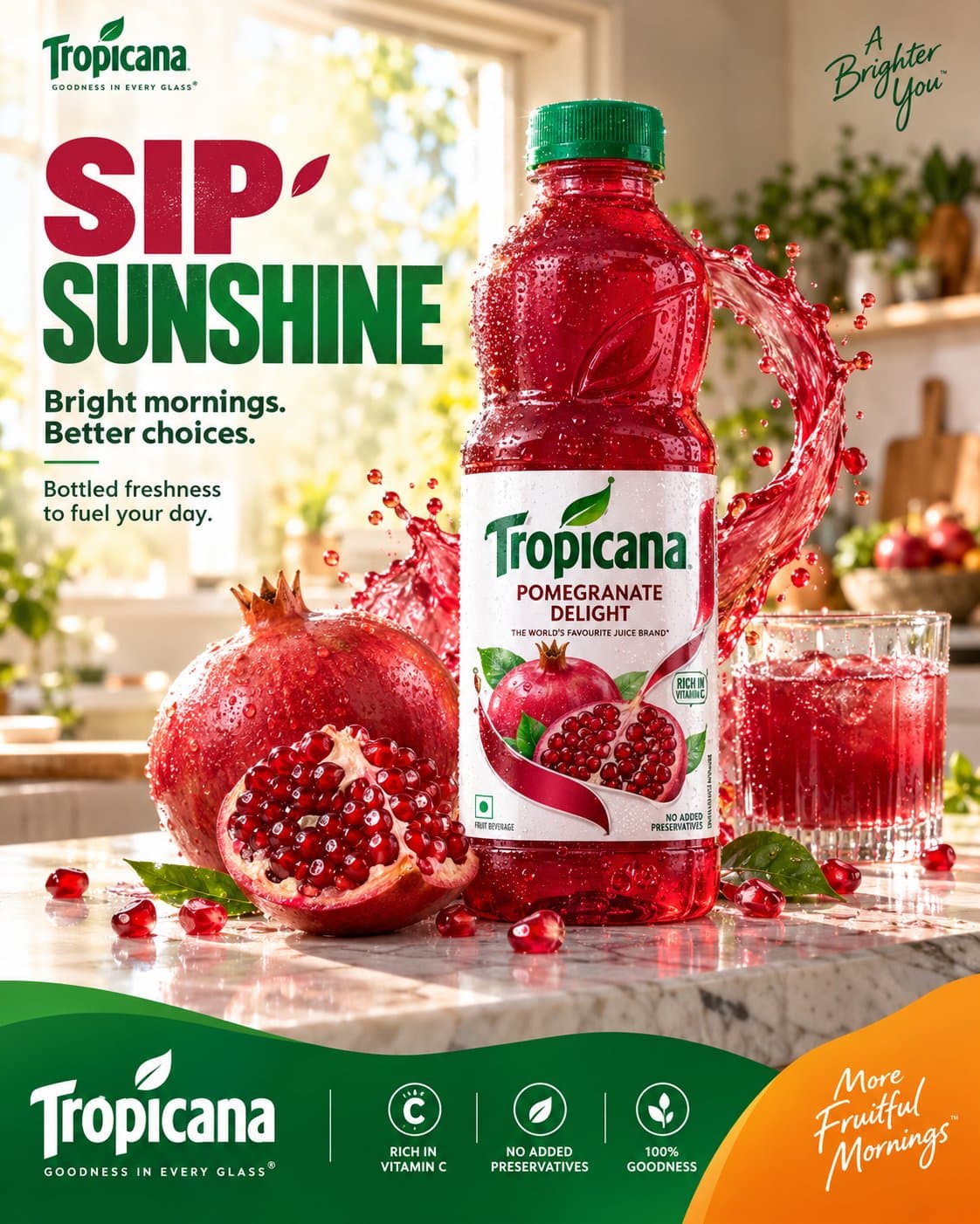
TROPICANA — “SIP SUNSHINE” MASTER RECREATION PROMPT PREMIUM FMCG SOCIAL MEDIA ADVERTISING / 4:5 ━━━━━━━━━━━━━━━━━━━━━━━━━━━━━━━━━━━━ 01 — SYSTEM ROLE You are an elite multidisciplinary creative intelligence system operating at the level of a world-class global branding agency. Domains of expertise: * beverage branding * FMCG advertising * Tropicana brand art direction * commercial product photography * food styling * liquid photography * social media campaign design * editorial graphic design * typography hierarchy * premium advertising campaigns * art direction and retouching Think like a hybrid of: Tropicana Global Creative Team × AKQA × Pentagram × premium commercial photography studio. Study the supplied reference image as a visual art-direction reference and reproduce its overall advertising logic, composition, hierarchy, color relationships and commercial polish while keeping the execution photorealistic and coherent. Do not make a generic juice poster. The result must feel like a deliberately art-directed Tropicana campaign, not an AI collage. ⸻ 02 — TASK Create a premium Tropicana Pomegranate Delight social media advertising poster. Core campaign message: SIP SUNSHINE Create a vibrant morning-freshness campaign featuring the authentic Tropicana Pomegranate Delight bottle as the hero product. The scene combines: premium morning kitchen + fresh pomegranate + chilled juice + controlled liquid movement + bold editorial typography + Tropicana brand colors. The final visual should communicate: freshness / optimism / vitality / natural fruit / better mornings. Platform: Instagram Aspect ratio: 4:5 vertical Canvas: 1080 × 1350 Source quality: 8K photorealistic commercial photography ⸻ 03 — BRAND DNA Brand: Tropicana Product: Pomegranate Delight Use the supplied bottle reference as the strict product reference. Preserve the recognizable: * transparent red bottle * green screw cap * bottle silhouette * bottle proportions * red pomegranate beverage * white Tropicana label * green Tropicana logo * pomegranate imagery * existing label hierarchy The bottle must look like the actual photographed product, not a redesigned AI interpretation. Brand personality: fresh / optimistic / natural / vibrant / approachable / premium mass-market. Primary visual colors: Tropicana green + pomegranate red + warm orange + clean white. The red of the product should provide the strongest secondary color while green remains the recognizable brand anchor. ⸻ 04 — CAMPAIGN OBJECTIVE Create immediate scroll-stopping appetite appeal. The viewer should instantly see: TROPICANA → POMEGRANATE → FRESH JUICE → MORNING ENERGY The emotional reaction should be: “That looks incredibly fresh.” The campaign should make the product feel cold, juicy, refreshing and desirable. Do not overload the viewer with product information. The creative should sell the experience of freshness, not function as a nutritional infographic. ⸻ 05 — HERO CONTEXT Create a bright, premium contemporary kitchen during a beautiful early morning. A large window in the background allows warm natural sunlight into the room. The background contains subtle: * green plants * soft kitchen architecture * natural morning highlights * lightly blurred household details Keep the environment sophisticated but understated. The foreground is a clean white/light marble kitchen counter. Place the Tropicana Pomegranate Delight bottle prominently toward the center-right. The bottle is freshly chilled and covered in realistic condensation. Beside the bottle: * one whole ripe pomegranate * one large freshly cut pomegranate * several naturally scattered pomegranate arils * a few fresh green leaves A transparent glass filled with ruby-red pomegranate juice sits subtly in the background/side of the composition. The fruit should look genuinely edible, wet and freshly prepared. ⸻ 06 — DIGITAL ENVIRONMENT Create one controlled ruby-red juice splash arc behind and around the bottle. The liquid should originate visually from the pomegranate environment and form a dynamic curved movement behind the hero product. The splash must remain physically believable. Use: * realistic viscosity * surface tension * transparent edges * natural droplets * subtle pulp * varied droplet sizes * realistic refraction * accurate highlights The liquid should feel like it was captured using an ultra-high-speed commercial camera. Do not create a giant explosion. The splash is a supporting visual device, not the hero. The bottle remains completely readable in front of it. Small pomegranate seeds may appear around the lower foreground, but keep them sparse and intentional. ⸻ 07 — COMPOSITION BLUEPRINT 4:5 vertical advertising composition. Structure the frame into three visual zones. TOP 30% Clean editorial typography. Place the headline prominently toward the upper-left: SIP SUNSHINE “SIP” in vibrant pomegranate/orange. “SUNSHINE” in Tropicana green. Keep the typography bold and compact. Below: Bright mornings. Better choices. Then a smaller supporting line: Bottled freshness to fuel your day. Typography should occupy the left side without touching the product. ⸻ CENTER 50% The product photography dominates. Tropicana bottle: largest + sharpest + brightest focal point. Position slightly right of center. Pomegranate fruit architecture surrounds the lower portion of the bottle. The juice arc creates movement around the product. The bottle must remain visually separated from the background. ⸻ BOTTOM 20% Create a sophisticated Tropicana brand footer. Use a flowing organic green wave across the bottom edge. Introduce a controlled orange corner/secondary shape on the lower-right. Place the Tropicana logo within the green footer. Add restrained supporting brand information and three small circular benefit icons. The footer must feel like a brand identity system, not an unrelated graphic panel. Maintain generous spacing. ⸻ 08 — TYPOGRAPHY SYSTEM Primary headline: SIP SUNSHINE Use a bold condensed contemporary sans-serif with strong advertising presence. Typography characteristics: * heavy weight * clean geometry * high readability * tight but controlled line spacing * confident alignment * modern FMCG character “SIP” should feel energetic. “SUNSHINE” should feel fresh and optimistic. Secondary copy should be significantly smaller. Suggested hierarchy: SIP largest SUNSHINE large Bright mornings. Better choices. medium Bottled freshness to fuel your day. small POMEGRANATE DELIGHT small product descriptor Do not allow typography to dominate the product photograph. All text must be crisp, professionally typeset and perfectly aligned. ⸻ 09 — GRAPHIC SYSTEM Build a cohesive Tropicana graphic language. Use: * Tropicana green * pomegranate red * warm orange * white * subtle organic curves * circular fruit geometry * clean editorial dividers * restrained iconography The lower green wave should have a smooth organic contour. The orange shape at the bottom-right should create a strong visual counterweight. Use small circular icons for: RICH IN VITAMIN C NO ADDED PRESERVATIVES 100% GOODNESS Keep icons extremely simple and consistent. Do not introduce unrelated graphics. The graphic system should feel like part of one professionally developed campaign identity. ⸻ 10 — LIGHTING / MATERIAL Premium commercial beverage photography. Use warm natural morning sunlight entering from the rear-left/right side. The sunlight should create: * luminous red juice * bright pomegranate highlights * subtle bottle rim light * warm countertop reflections * natural atmospheric depth Use controlled professional fill light to keep the product label perfectly readable. Bottle: * realistic condensation * tiny water droplets * subtle reflections * accurate transparent plastic behavior * realistic red liquid density Pomegranate: * glossy arils * wet membranes * natural irregularity * realistic seeds * detailed fruit skin * subtle moisture Counter: * realistic marble texture * controlled reflections * natural contact shadows * slight moisture around fruit and bottle The overall photograph should resemble a professionally lit Canon/Sony medium-format commercial beverage shoot, not CGI. ⸻ 11 — ANTI-SLOP ABSOLUTELY AVOID: * generic juice advertisement aesthetics * random fruit explosions * excessive liquid * impossible splash physics * dozens of floating seeds * duplicated pomegranates * duplicated leaves * plastic-looking fruit * fake CGI juice * excessive bloom * excessive HDR * neon colors * extreme saturation * artificial lens flare * fantasy kitchen * excessive props * floating bottle * distorted bottle silhouette * incorrect cap * redesigned packaging * warped Tropicana logo * invented packaging claims * misspelled typography * random icons * excessive graphic decoration * giant secondary logo * cluttered footer * generic Canva layout * stock-photo composition * cheap promotional flyer appearance * excessive depth blur * fake cinematic grading * meaningless visual effects Do not make every element equally important. Product photography must remain the dominant visual language. Graphics should support the photograph. ⸻ 12 — QUALITY BAR Final output must feel like a real premium Tropicana social advertising campaign. Target: GLOBAL FMCG QUALITY × COMMERCIAL PHOTOGRAPHY × BEHANCE-LEVEL ART DIRECTION Self-evaluate before finalizing: Brand Alignment — 10/10 Product Accuracy — 10/10 Freshness — 10/10 Appetite Appeal — 10/10 Composition — 10/10 Typography — 9+/10 Graphic System — 9+/10 Photorealism — 10/10 SMM Stopping Power — 10/10 Originality — 9+/10 If any area feels generic, cluttered, artificial or AI-generated, refine it. FINAL ART-DIRECTION RULE The supplied reference establishes the composition and campaign grammar: bold headline → premium morning environment → hero bottle → fruit architecture → controlled juice movement → branded footer. Do not merely reproduce objects. Recreate the advertising intelligence behind the composition. The final image should look like: A finished Tropicana campaign that happens to have been generated with AI. Not: an AI image attempting to look like an advertisement. 4:5 vertical • 8K • ultra-photorealistic • premium FMCG photography • precise product styling • sophisticated editorial design • authentic Tropicana branding • commercial retouching • Behance case-study quality • campaign-ready.