전체 Image 2.5 프롬프트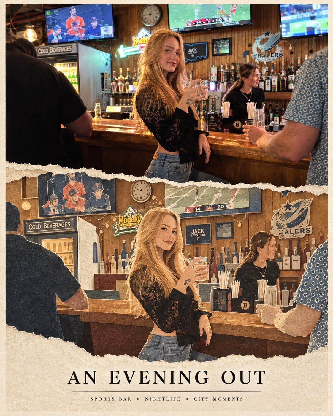
- 모델
- GPT Image 2.5
- 카테고리
- 일러스트·종이 공예
참조 이미지가 필요한 프롬프트입니다. 제작할 때 자신의 이미지를 업로드하세요.
원본 프롬프트
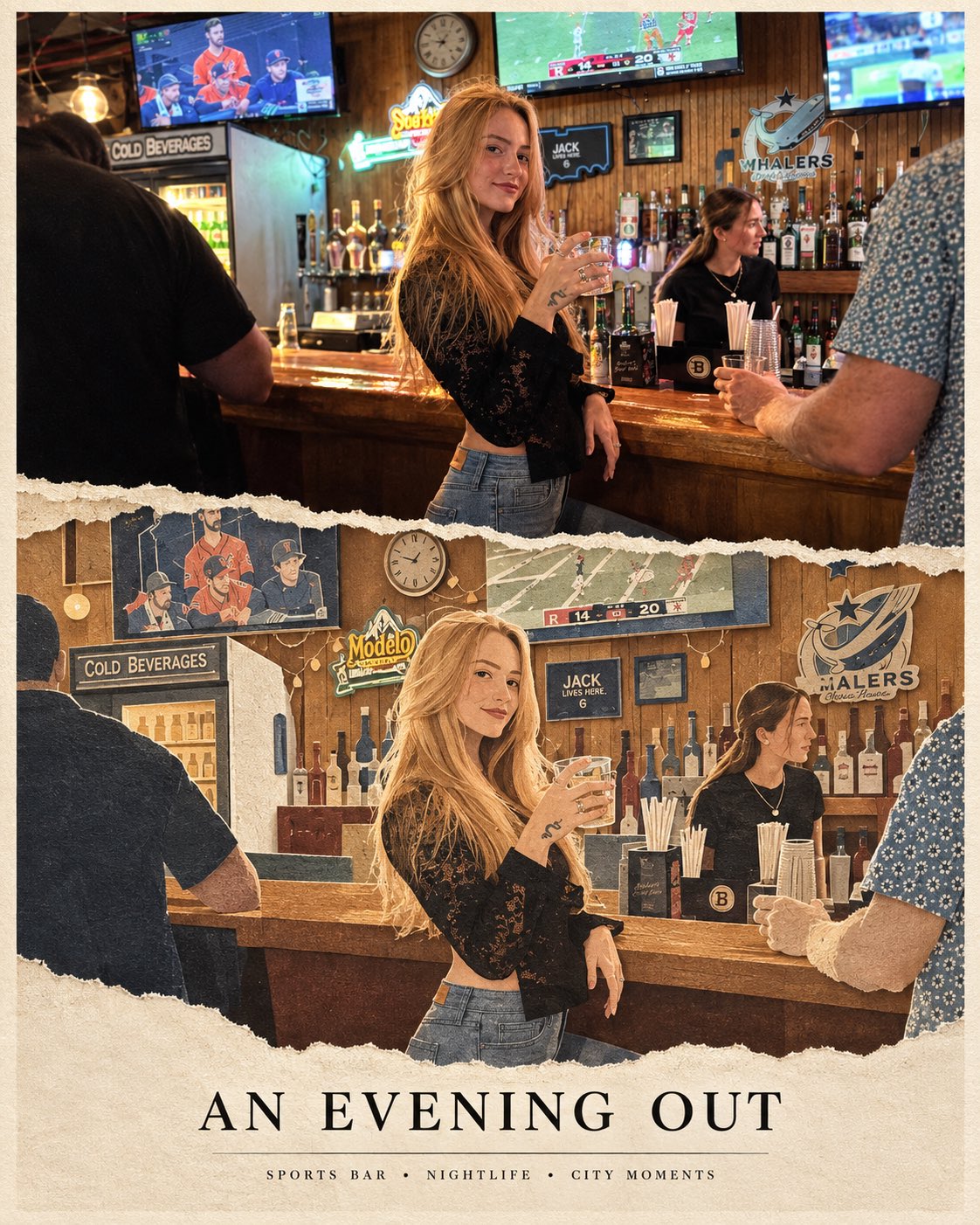
Create a premium 4:5 editorial poster using the provided photograph of [PERSON]. The top half is a realistic cinematic photograph, preserving the person’s exact identity, face, pose, clothing, hairstyle, and environment.

The bottom half transforms the same scene into a beautiful handcrafted layered paper-cut illustration, recreating the person and their world using textured paper, torn edges, embossed layers, subtle shadows, delicate linework, and miniature environmental details representing [THEIR CITY / PROFESSION / HOBBY / JOURNEY].

Use warm ivory paper, muted sophisticated colors, tactile paper grain, elegant serif typography, minimalist supporting text, generous negative space, and a refined luxury travel-editorial aesthetic.

Photograph above → paper-crafted story below.
Make the transition seamless, artistic, emotional, and highly recognizable.
출처: @Naiknelofar788
일러스트·종이 공예 예시 더 보기
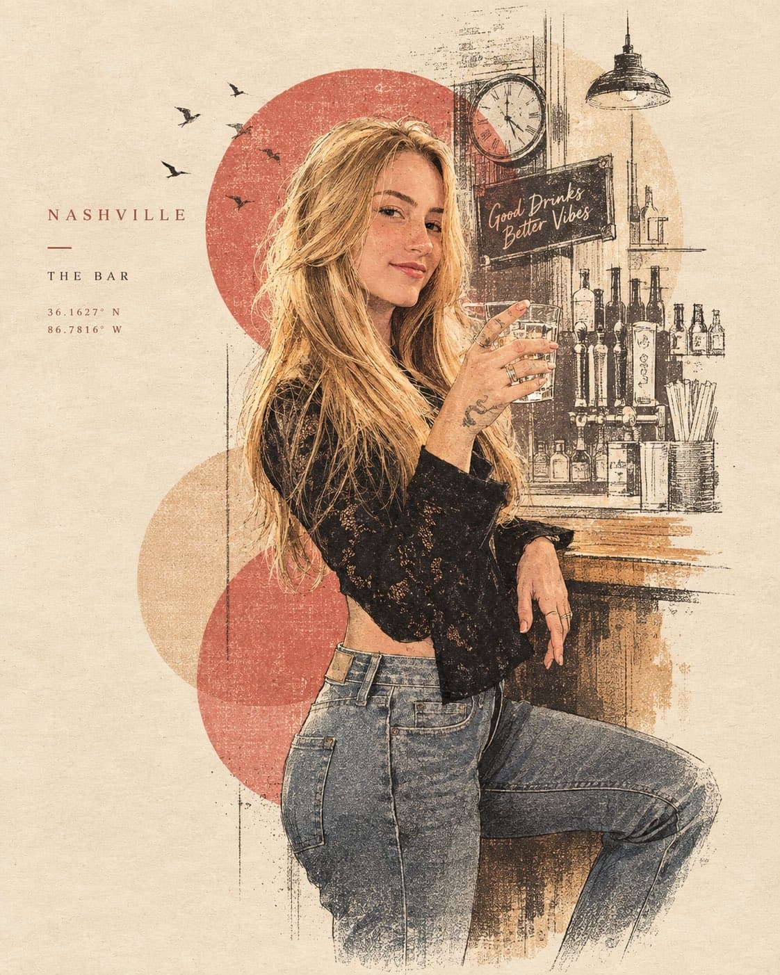
A sophisticated minimalist lifestyle art poster featuring [PERSON / SUBJECT / MOMENT] as the central focus, transformed from a real-life photograph into a refined hand-drawn editorial illustration. Preserve the subject’s recognizable pose, silhouette, clothing, hairstyle, and key visual details while simplifying the scene into an elegant artistic composition. Use a limited vintage color palette inspired by the original environment, with warm muted tones printed on an ivory/off-white paper background. Combine delicate ink outlines, loose sketchwork, fine hatching, subtle halftone texture, faded print imperfections, and soft watercolor-like washes. Reduce the surrounding environment into a few recognizable contextual elements—[CAFÉ / BAR / STREET / LANDMARK / OBJECTS]—using simplified linework and layered shapes rather than detailed realism. Add subtle abstract circles, geometric forms, atmospheric marks, tiny decorative elements, or silhouettes to create visual depth. Include small minimalist typography on one side: [CITY / LOCATION], [SUBJECT / MOMENT], and optional coordinates, date, or short descriptor, designed like a premium collectible travel/lifestyle print. Generous negative space, elegant editorial composition, vintage screen-print aesthetic, hand-crafted illustration, sophisticated travel-magazine design, muted heritage colors, subtle paper grain, artistic but recognizable, no photorealistic background, no excessive details, 4:5 vertical composition.
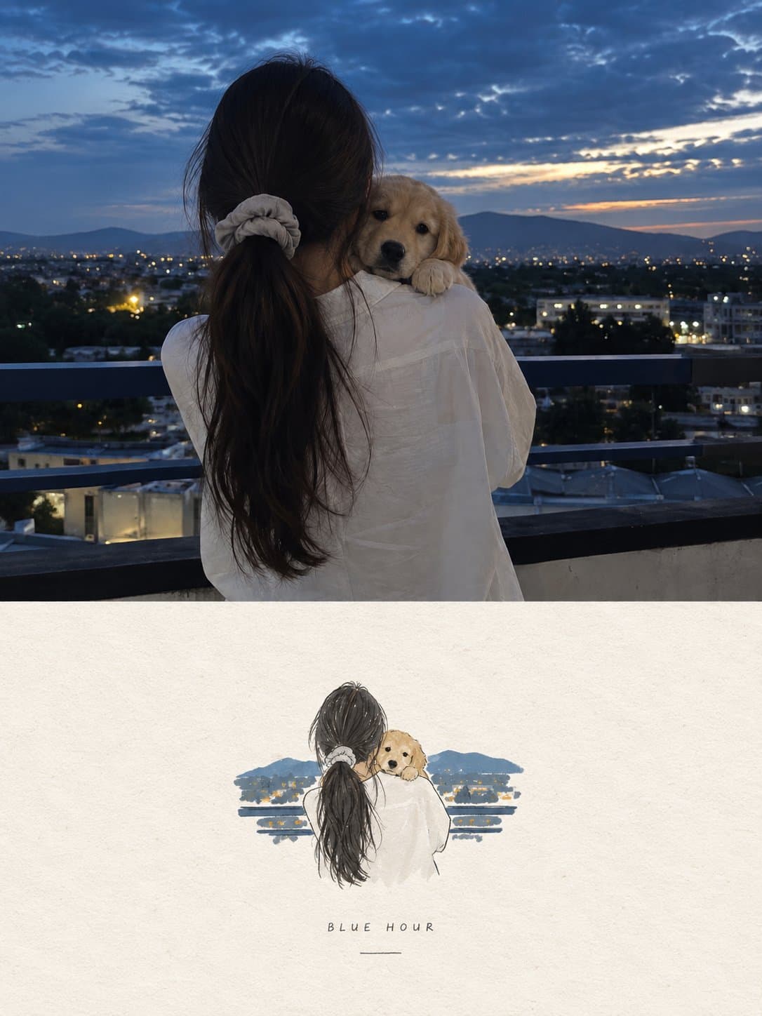
Create a high-end editorial poster using the uploaded photo as the exact reference, in a strict 3:4 vertical format divided horizontally into two equal 50/50 sections. Preserve the original photo faithfully in the top half, including subjects, identity, pose, clothing, objects, lighting, colors, and realistic texture, with only subtle premium editorial color grading. In the bottom half, reinterpret the most recognizable elements as a small, centered, minimalist handmade paper illustration using delicate imperfect lines, bold flat acrylic-like color shapes, subtle paper grain, organic edges, and no more than 4 colors extracted from the original photo. Keep the illustration only 10–20% of the bottom section with lots of warm off-white negative space and optional minimal editorial typography. The overall result should feel quiet, poetic, refined, artistic, premium, and like an independent art-book cover, avoiding cartoon, watercolor, colored-pencil, 3D, glossy, busy, or commercial aesthetics.
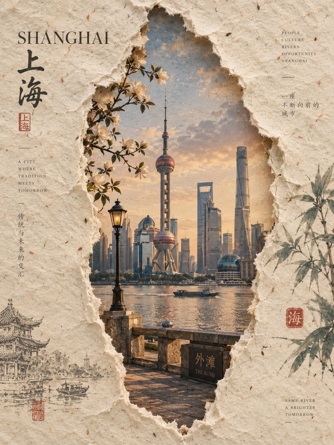
Create a premium 3:4 vertical handmade-paper editorial artwork for [COUNTRY / LOCATION / SUBJECT]. VISUAL GENERATION Build the entire composition creatively from the words [COUNTRY / LOCATION / SUBJECT]. Automatically imagine the most iconic visual identity, environment, architecture, landscape, people, atmosphere, and cultural details associated with the subject. PAPER Fill the entire frame with one thick, warm ivory sheet of authentic handmade paper. Show visible mulberry fibers, tiny fibers, subtle wrinkles, natural speckles, faint stains, uneven handmade texture, and soft physical imperfections. CENTRAL TORN WINDOW Create one tall, organic vertical tear through the center of the paper. The opening should occupy roughly 30–40% of the frame width and 60–70% of the frame height, with an elongated natural shape. Make the edges irregular and naturally hand-torn, with exposed white fibers, small variations in width, slightly lifted paper edges, and delicate realistic shadows. Never make the tear perfectly straight, geometric, symmetrical, or machine-cut. SCENE INSIDE THE OPENING Reveal a beautifully composed realistic representation of [COUNTRY / LOCATION / SUBJECT] through the torn opening. Automatically select the most recognizable landmark, architecture, landscape, street, cultural element, or environmental feature. The revealed scene should feel subtly integrated with the handmade paper, with softened colors, gentle atmospheric fading, and visible interaction between the scene and surrounding paper fibers. BOTANICAL DETAILS Place only a few dried natural elements around the tear: several dark green leaves and a small cluster of delicate white dried flowers. Keep them sparse and elegant, with visible veins, dried edges, and subtle physical shadows. Never form a wreath or decorative border. Add one or two extremely thin, loose pencil-like marks across the empty paper. They should feel like quiet unfinished artistic gestures, not recognizable drawings. TYPOGRAPHY Place a short poetic Korean phrase in the upper-left blank area, elegantly arranged within three lines or fewer. Add one very small atmospheric Korean sentence in the lower-right blank area. Use refined thin Korean editorial typography in deep charcoal. Keep all lettering inside the empty paper areas. No numbers, dates, years, logos, brands, signatures, watermarks, or decorative typography. FINAL AESTHETIC Quiet contemporary Korean editorial design × tactile handmade paper × organic paper tear × refined travel artwork × minimal dried botanicals × sophisticated negative space. The result should feel like a real handcrafted art print photographed directly from above, with authentic physical materials, natural shadows, muted colors, delicate imperfections, and premium editorial composition. AVOID Split layouts, multiple tears, geometric openings, smooth machine-cut edges, excessive flowers, wreaths, clutter, glossy surfaces, plastic texture, excessive saturation, artificial gradients, cartoon styling, 3D rendering, random landmarks, excessive text, numbers, logos, signatures, watermarks, or interface elements. FORMAT: 3:4 vertical, single unified composition.